Code
import os
import pandas as pd
import numpy as np
import fastf1

os.makedirs('cache', exist_ok=True)
fastf1.Cache.enable_cache('cache')
np.random.seed(123)My journey with Formula 1 dates back to secondary school. My siblings and I grew up sitting with our dad in the living room, watching these cars go around circuits on weekends. My father, an engineer, now retired introduced us to the sport very early not directly but just sitting in the living room as he watched the races. I’ll be honest, at a young age, cars going round and round wasn’t exactly exciting and I particulary looked forward to the races ending and switching back to the premier league. But as you grow, it grows on you. It took a while to understand the layers of strategy, engineering and competition underneath the spectacle, but once I did, there was nothing quite like it.
But with F1 every season seems new, you’re always learning. I came across the FastF1 Python library almost by accident, through one of the now common crop of data science content creators on social media. Yes, data science influencers exist and this particular creator has genuinely informative content. I find myself learning something new with every scroll.
Now that “my team” Red Bull looks set to be competing behind the Mercedes and Ferraris after these opening two races, I suppose it’s time to let my friends have their way with the banter. After four years of Max’s world championships, haven’t I trolled them enough? But oh well, I plan to spend most of this season playing with the F1 data to see if there are any untold stories hiding in the numbers.
For this analysis, I set out to answer a simple question: What does early-season data tell us about each car’s underlying pace and characteristics after just two races? These are not definitive conclusions, they are more like educated guesses based on the data available so far. As usual, this is a data analysis tutorial to show my approach.
So, with that out of the way, let’s build the performance profile for some F1 cars.
Every F1 car is built around trade-offs. Teams that optmise settings better get the best out of the car for example with more downforce means slower on the straights. Better braking stability might come at the cost of tyre wear in this case a lap time tells you who’s fast, but it hides where and why they’re fast. During the races a good way to see this is to watch the onboard footage and see where the cars are gaining or losing time relative to each other in the different sectors. But that’s a lot of eyeballing, and it’s hard to summarise into a clear picture of each car’s strengths and weaknesses.
To define the Performance Profile we decompose each team’s performance into sector level strengths and weaknesses. Each circuit is divided into three sectors, and each sector tests different aspects of the car i.e., some are dominated by long straights (power), others by fast corners (downforce), and some by heavy braking zones. By normalising sector times and mapping them to these categories, we can build a multi-dimensional performance profile that reveals what each car is actually good at.
Two races is a very small sample. Melbourne and Shanghai test overlapping but different skills. What follows is an early-season snapshot, not a definitive analysis. The profile will stabilise as the season progresses and we accumulate data from more varied circuits.
We use the fastf1 library to pull official F1 timing data. This gives us lap-by-lap sector times, speed trap readings, tyre information, and more.
import os
import pandas as pd
import numpy as np
import fastf1
os.makedirs('cache', exist_ok=True)
fastf1.Cache.enable_cache('cache')
np.random.seed(123)We collect data from every session across both race weekends. Practice sessions show baseline performance with varied programmes, qualifying reveals peak single-lap pace and race data tells us about long-run degradation and race speed.
YEAR = 2026
RACES = {
    'Australian Grand Prix': ['FP1', 'FP2', 'FP3', 'Q', 'Race'],
    'Chinese Grand Prix': ['FP1', 'SQ', 'S', 'Q', 'Race'],
}

KEEP_COLS = [
    'Driver', 'DriverNumber', 'Team', 'LapNumber', 'LapTime',
    'Sector1Time', 'Sector2Time', 'Sector3Time',
    'SpeedI1', 'SpeedI2', 'SpeedFL', 'SpeedST',
    'Compound', 'TyreLife', 'FreshTyre',
    'IsPersonalBest', 'Deleted', 'IsAccurate',
]

all_laps = []
for race_name, session_types in RACES.items():
    for stype in session_types:
        try:
            session = fastf1.get_session(YEAR, race_name, stype)
            session.load()
        except Exception as e:
            print(f"  [{race_name} | {stype}] Skipped: {e}")
            continue
        lap_data = session.laps
        if lap_data is None or len(lap_data) == 0:
            print(f"  [{race_name} | {stype}] No lap data found")
            continue
        available = [c for c in KEEP_COLS if c in lap_data.columns]
        df = lap_data[available].copy()
        df['Year'] = YEAR
        df['RaceName'] = race_name
        df['Round'] = session.event['RoundNumber']
        df['CircuitName'] = session.event['Location']
        df['SessionType'] = stype
        all_laps.append(df)
        # print(f"  [{race_name} | {stype}] {len(df)} laps loaded")

combined = pd.concat(all_laps, ignore_index=True)Not every lap is useful for the analysis, therefore pit in-laps, out-laps, and deleted laps (track limits) don’t represent genuine car performance and are dropped. We convert the timedelta sector times into float seconds, because in f1, even the smallest micro-second is a big differentiator.
def timedelta_to_seconds(td_series):
    return td_series.dt.total_seconds()

def clean_laps(laps_df):
    df = laps_df.copy()
    # filter for genuine performance laps
    if 'Deleted' in df.columns:
        df = df[df['Deleted'] != True]
    if 'IsAccurate' in df.columns:
        # remove laps with pit stops, major mistakes, or SC periods
        df = df[df['IsAccurate'] == True]
    # drop rows with missing sector data
    sector_cols = ['Sector1Time', 'Sector2Time', 'Sector3Time']
    df = df.dropna(subset=sector_cols)
    # convert to float seconds
    for col in sector_cols + ['LapTime']:
        if col in df.columns and pd.api.types.is_timedelta64_dtype(df[col]):
            df[col + 'Sec'] = timedelta_to_seconds(df[col])
    return df

laps = clean_laps(combined)
The resulting dataset provides a comprehensive snapshot across two distinct weekend formats:
Australian Grand Prix: A standard format featuring three full practice sessions (FP1, FP2, FP3) followed by Qualifying and the Race.
Chinese Grand Prix: A Sprint weekend, which limits testing to a single practice session (FP1) before moving into Sprint Qualifying, the Sprint Race, Grand Prix Qualifying, and the main Race.
This resulted in to total laps: 3509 across 11 teams and 22 drivers, giving us the dataset to explore performance patterns.
Each circuit is divided into three sectors. The key insight is that different sectors test different aspects of the car:
We classify each sector using a combination of circuit knowledge and speed trap validation. The speed traps (SpeedI1, SpeedI2, SpeedFL, SpeedST) tell us how fast cars are travelling at key points, where high speeds suggest straights (power), moderate consistent speeds suggest corners (downforce).
SECTOR_CLASSIFICATION = {
    'Melbourne': {
        1: 'downforce',  # turns 1-4: medium-speed technical corners
        2: 'power',      # high-speed sweepers testing Aerodynamics and MGU-K deployment
        3: 'braking',    # heavy braking into chicanes
    },
    'Shanghai': {
        1: 'downforce',  # turns 1-4: tight, twisty sequence
        2: 'downforce',  # medium-high speed (turns 5-10)
        3: 'power',      # 1.2km straight testing MGU-K efficiency
    },
}

def get_sector_type(circuit_name, sector_num):
    # specify circuit names
    for key, sectors in SECTOR_CLASSIFICATION.items():
        if key.lower() in circuit_name.lower():
            return sectors.get(sector_num, 'mixed')
    return 'mixed'
Let’s validate this with the actual speed trap data:
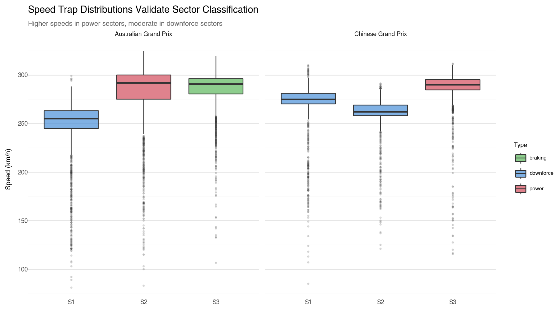
The data confirms our theory, the “Power” sectors (Melbourne S2 and Shanghai S3) produce the highest top speeds, while the “Downforce” sectors show lower, more consistent speeds.
We can’t directly compare a “fast” lap in Australia to one in China because tracks differ in length, layout, and other characteristics. Likewise, a fast lap on a hot Friday isn’t the same as one on a cool Sunday. Normalisation removes these differences, allowing us to compare performance on a consistent, “apples-to-apples” basis.
Instead of looking at seconds, we look at Percentage of the Median. We find the “middle” time (the Median) and set that as 100.
We used the median here because it’s more robust to outliers. A single lap with traffic or a mistake can skew the mean, but the median gives us a stable reference point for normalisation.
def normalize_sector_times(df, group_cols, sector_col):
    median = df.groupby(group_cols)[sector_col].transform('median')
    return (df[sector_col] / median) * 100

sectors['NormalizedTime'] = normalize_sector_times(
    sectors, ['Round', 'SessionType', 'Sector'], 'SectorTimeSec'
)Not all sessions carry equal information. Qualifying represents peak performance with low fuel, fresh tyres, maximum one lap speed, while race sessions show true long-run pace. Practice is noisier, with teams running varied testing programmes.
We apply a Weighted Normalisation to ensure our “Performance Profile” is built on the most reliable data points. Qualifying is weighted highest (3x), followed by the Race and Sprint (2x), with Practice sessions providing the baseline (1x).
| Weighted Car DNA: Sector Performance Scores | |||
|---|---|---|---|
| Lower = faster. Score = % of field median lap time, weighted by session importance. | |||
| Team | Sector Performance (% of field median) | ||
| Braking | Downforce | Power | |
| Mercedes | 99.91059 | 99.45740 | 100.39905 |
| Red Bull Racing | 100.54613 | 102.37507 | 102.50688 |
| Haas F1 Team | 104.80705 | 103.58413 | 103.61387 |
| Cadillac | 107.46104 | 103.79097 | 103.78552 |
| Ferrari | 103.54055 | 101.67055 | 103.81224 |
| Alpine | 107.68701 | 103.59588 | 104.30832 |
| Racing Bulls | 105.96724 | 102.69486 | 104.34193 |
| Williams | 104.29718 | 103.28610 | 104.79704 |
| McLaren | 105.10159 | 102.60815 | 104.81599 |
| Aston Martin | 105.87299 | 104.21629 | 105.37280 |
| Audi | 105.78322 | 104.40963 | 105.41126 |
| Field Average | 104.63405 | 102.88082 | 103.92408 |
| Green = faster than median. Red = slower. Weights: Q×3, Race/Sprint×2, FP×1. | |||
The weighted Performance Profile table compares 11 teams across three key performance areas: Braking, Downforce, and Power. Each cell shows the team’s average sector time as a percentage of the field median, weighted by session importance.
From the data, Mercedes stand out as the strongest team overall. They are the fastest in all three areas and especially strong under braking, where they have the biggest advantage over the rest of the field. This suggests a very well-balanced and efficient car.
McLaren and Red Bull are very close competitors. McLaren have a slight edge overall, mainly because they are stronger in power, meaning better straight-line speed. Red Bull are just slightly better under braking, but the differences between the two teams are very small, especially in downforce where they are almost equal.
Ferrari show a clear weakness in downforce. While they are competitive in braking and power, they lose the most time in medium-speed corners.
At the bottom of the table, Williams, Cadillac, and Aston Martin are clearly behind the rest. Aston Martin in particular struggles the most, especially in braking, where their performance is far worse than any other team.
Now we construct the actual profile vectors. Each team gets six dimensions that capture different performance aspects. We centre each metric around the field mean, so positive values mean faster/better and negative values mean slower/weaker than the rest of the grid.
| Dimension | What it measures | How we compute it |
|---|---|---|
| Power sector | Speed on straights | Normalised times in power-classified sectors |
| Downforce sector | Corner performance | Normalised times in downforce-classified sectors |
| Braking sector | Braking zone performance | Normalised times in braking-classified sectors |
| Top speed | Raw straight-line speed | Median SpeedST vs field median |
| Qualifying pace | Single-lap peak performance | Personal best lap in qualifying |
| Race pace | Long-run race performance | Filtered representative race laps |
To measure qualifying performance, we focus on each driver’s single fastest lap per session. This reflects true peak performance, which is what qualifying is designed to capture.
We extract each driver’s personal best lap, normalise it relative to the field median for that round, and then aggregate to team level.
Race pace is designed to capture true long-run performance, so we first filter out laps that do not represent normal racing conditions.
We keep only laps that are:
This gives a race pace metric that reflects each team’s typical performance under normal racing conditions, relative to the field.
In this step, we bring all the individual components together to construct the final Performance Profile for each team.
We start by aggregating sector-level performance. For every team, sector, and race weekend, we compute a weighted average of normalised sector times, using the session weights defined earlier. This ensures that more representative sessions, such as qualifying and the race, have a greater influence on the final result. We also retain the median normalised time and the number of laps used.
This will produce a clean dataset of team-sector performance, where each value reflects a stable and weighted estimate of how a team performs in a specific type of corner or track segment.
Next, we transform this into sector-type performance by averaging across all rounds. The three sector types, braking, downforce, and power are then centred around the field mean. This step is important because it converts the values into a relative scale:
This makes it easy to directly compare strengths and weaknesses between teams across different performance dimensions.
| Performance Profile: Early Season Performance Snapshot | |||||||
|---|---|---|---|---|---|---|---|
| Teams ranked by overall performance score | |||||||
| Team | Sector Performance | Performance Metrics | Overall | ||||
| Braking | Downforce | Power | Top Speed | Qualifying | Race Pace | ||
| Mercedes | 4.72 | 3.42 | 3.54 | 2.36 | 1.85 | 2.11 | 3.0 |
| Red Bull Racing | 4.09 | 0.66 | 1.28 | 3.89 | 0.86 | 0.38 | 1.86 |
| Ferrari | 1.09 | 1.2 | 0.13 | 1.35 | 1.16 | 1.59 | 1.09 |
| McLaren | -0.47 | 0.4 | -0.72 | -2.03 | 1.05 | 1.65 | -0.02 |
| Haas F1 Team | -0.17 | -0.7 | 0.36 | -0.68 | 0.13 | 0.03 | -0.17 |
| Racing Bulls | -1.33 | 0.25 | -0.29 | 0.0 | 0.03 | -0.14 | -0.25 |
| Alpine | -3.05 | -0.78 | -0.42 | 1.01 | 0.18 | -0.25 | -0.55 |
| Williams | 0.34 | -0.26 | -0.68 | -2.53 | -0.87 | -0.55 | -0.76 |
| Audi | -1.15 | -1.54 | -1.47 | -1.69 | 0.1 | 0.13 | -0.94 |
| Cadillac | -2.83 | -1.22 | -0.11 | 1.52 | -2.5 | -2.11 | -1.21 |
| Aston Martin | -1.24 | -1.42 | -1.63 | -0.84 | -1.98 | -2.85 | -1.66 |
| Teams ranked by average of all six performance dimensions. | |||||||
This table ranks teams using a six-dimensional Performance Profile, where positive values indicate above average performance and negative values indicate below average performance.
Mercedes are the clear benchmark, leading across all areas with the most complete and balanced car. Red Bull Racing rank second, driven by outstanding top speed and strong braking performance, though their race pace lags behind their qualifying form. Ferrari and McLaren follow closely; Ferrari are stronger in qualifying and race pace, while McLaren’s edge comes from their qualifying and long-run pace rather than sector performance, where they are slightly below the field average.
In the midfield, Racing Bulls lead, with Haas F1 Team, Alpine, and Audi showing mixed and more average performance. At the bottom, Williams, Cadillac, and Aston Martin trail the field, with Aston Martin the weakest overall.
The performance profile heatmap shows each team’s strengths and weaknesses across six key areas:
For example, Mercedes has almost all green cells which shows they are strong across all aspects, both in corners and on the straights whereas Aston Martin has mostly red cells, showing weaknesses in nearly every area, especially braking and race pace.
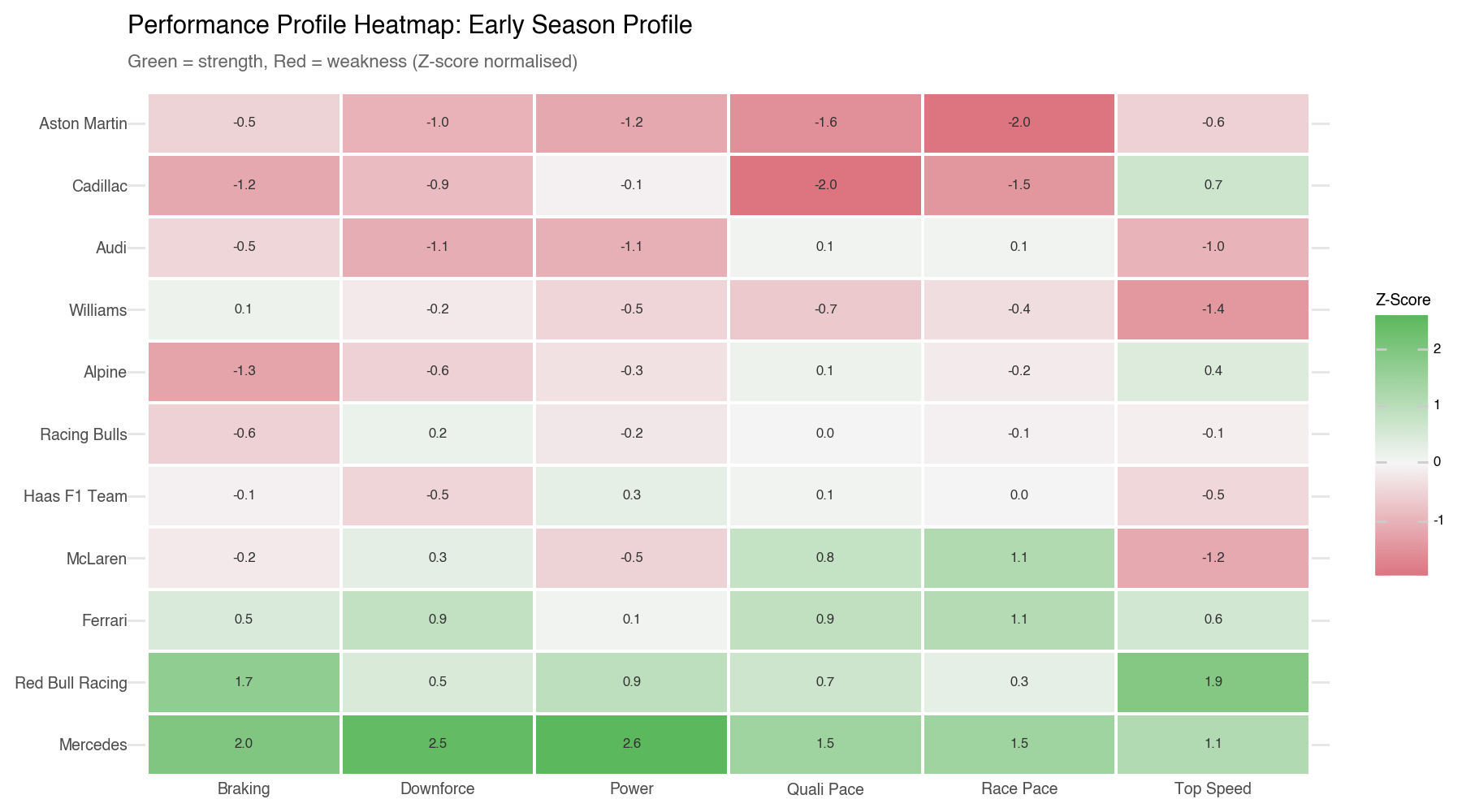
In this case we used the z-score as a way of showing how far a team is from the average, scaled so we can compare across the six different dimensions. A z-score of +2 means the team is 2 standard deviations better than the average in that dimension, while a z-score of -1 means they are 1 standard deviation worse. Therefore a high positive z-score is what we want to see in the green cells, while a negative z-score is what we want to avoid in the red cells.
Analyzing the heatmap, we can see that Mercedes has strong positive z-scores across all dimensions, confirming their dominance. Red Bull Racing has a very high z-score in top speed but more moderate scores in other areas. Ferrari and McLaren show mixed profiles with some strengths and weaknesses. The midfield teams have more balanced but generally weaker profiles, while the bottom teams have negative z-scores across most dimensions, indicating they are below average in nearly every aspect of performance.
With six performance dimensions per team, we can ask: which teams have fundamentally similar cars? Hierarchical clustering groups teams by the similarity of their performance profiles, revealing shared performance tiers.
The algorithm starts with each team as its own cluster, then repeatedly merges the two closest clusters until only one remains. The result is a dendrogram, a tree diagram showing the full hierarchy of relationships. You can think of it as a family tree for car performance.
We use Ward’s linkage as the merging criterion. At each step, Ward’s method merges the two clusters that produce the smallest increase in total within-cluster variance (Ward, 1963). This tends to produce compact, similarly-sized groups, which matches our intuition about F1 team tiers where the grid typically separates into a few distinct performance bands as we have seen in our analysis up to this stage.
We thought of using K- Means but with only 11 teams, k-means is sensitive to initialisation, small random changes have a tendency to flip cluster assignments. So in this case hierarchical clustering is a better option and, crucially, produces the dendrogram which shows us the degree of similarity between the teams, not just the final groupings.
from scipy.cluster.hierarchy import linkage, fcluster, dendrogram
import matplotlib.pyplot as plt
import matplotlib

matplotlib.rcParams.update({'font.size': 8})

X = dna[feature_cols].fillna(0).values
teams = dna['Team'].values

scaler_clust = StandardScaler()
X_scaled = scaler_clust.fit_transform(X)

linkage_matrix = linkage(X_scaled, method='ward')Teams that merge at low heights have very similar profiles; those merging higher up are quite different. The dashed line shows where we cut to form three groups.
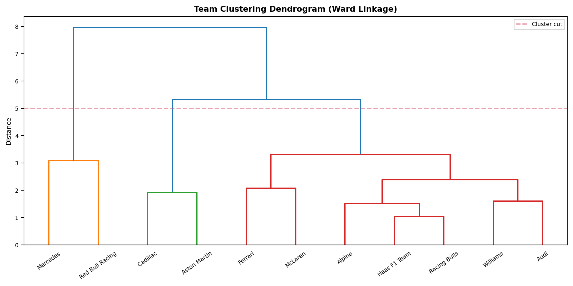
The results from the dendrogram give us four distinct groups of teams based on their performance profiles:
Group 1 (Mercedes, Red Bull Racing): The top tier. Both teams are well above the field average across all dimensions, though Mercedes lead on balance while Red Bull are particularly dominant in top speed.
Group 2 (Ferrari, McLaren): A close second tier. Ferrari and McLaren share a similar overall level of competitiveness, each with slightly different strengths. Ferrari stronger in qualifying and race pace and McLaren more balanced across sector types.
Group 3 (Racing Bulls, Haas, Alpine, Williams, Audi): The midfield cluster. Teams here are broadly similar in overall pace, with mixed strengths and weaknesses and no standout advantages in any single dimension.
Group 4 (Cadillac, Aston Martin): These teams are the most distant from the rest of the field, showing consistent weaknesses across nearly all performance metrics.
The groupings make intuitive sense when you think about what each team shares beyond just lap times. Mercedes and Red Bull are joined by the fact that both are able to extract strong performance across the two track, neither has a single glaring weakness that costs them time consistently, even though their how differs: Mercedes through a balanced, efficient car, Red Bull through outright top-end speed. The algorithm picked this up possibly because their performance profile vectors point in broadly the same positive direction across most dimensions, even if the magnitudes differs.
Ferrari and McLaren cluster together not because their cars are technically alike, but because they occupy the same competitive space: genuinely fast but with specific limitations. Their overall scores are very close (1.09 vs -0.02), and the algorithm sees them as more similar to each other than to Mercedes or to the midfield. They are both teams that can challenge for wins on the right circuit but haven’t yet matched Mercedes’s consistency across all six dimensions.
The midfield group (Racing Bulls, Haas, Alpine, Williams, Audi) is the most diverse within its cluster. These teams don’t necessarily share a design philosophy but they share a performance profile: modest in all dimensions, with no standout advantage and no catastrophic weakness either. The algorithm probably merges them because their performance profile vectors are all clustered tightly around zero, meaning they are uniformly average.
Cadillac and Aston Martin stand apart because both show consistent negative values across nearly every dimension. They are not slow in one specific way, they are slow everywhere. That uniform underperformance is exactly what the algorithm detects and separates them from the rest.
It is useful to check these clusters against what actually happened on track. The table below shows the finishing positions from both races:
| Team | Australia | China |
|---|---|---|
| Mercedes | 1st, 2nd | 1st, 2nd |
| Ferrari | 3rd, 4th | 3rd, 4th |
| McLaren | 5th (Norris), Piastri DNS | Norris & Piastri DNS |
| Red Bull | 6th (Verstappen), Hadjar DNF | Hadjar 8th, Verstappen DNF |
| Haas | 7th (Bearman) | 5th (Bearman) |
| Racing Bulls | 8th (Lindblad) | 7th (Lawson) |
| Alpine | 10th (Gasly) | 6th (Gasly) |
| Audi | 9th (Bortoleto) | DNS |
| Williams | 12th, 15th | Albon DNS |
| Cadillac | 16th, Bottas DNF | 13th, 15th |
| Aston Martin | Both DNF/NC | Both DNF |
The top of the table broadly validates the clustering. Mercedes, Ferrari, the midfield pack, and the backmarkers all ended up more or less where the performance profile analysis placed them. However, two clusters tell a more complicated story.
Red Bull is the most striking example. The performance profile places them clearly in the top tier alongside Mercedes, with the highest top speed score of any team on the grid and solid braking performance. In the races, though, they finished 6th and 8th, with mechanical failures striking both Australia (Hadjar DNF) and China (Verstappen DNF). This is not a case where the performance profile analysis was wrong, it is more a case where the race result is misleading. The underlying pace was there; reliability took the points away.
McLaren presents a different but related problem. Their performance profile score is essentially neutral (−0.02), which groups them with Ferrari in the second tier. Yet across both races, Piastri did not start either race (DNS), and Norris only scored points in Australia before also failing to start in China. McLaren’s low score shows a mismatch in the data, the car is fast in races and qualifying, but weaker in some sectors. The missed starts were due to reliability and made their race positions look worse than their actual speed.
The Performance Profile measures a car’s inherent performance, not reliability, driver mistakes, or race incidents. Strong Performance Profile doesn’t guarantee points, and weak Performance Profile can still score if others fail. As more races are added, reliability issues will matter less, and the profile clusters will better reflect each team’s true potential. For now, the results show that while the Performance Profile analysis captures underlying performance, it cannot predict the unpredictable elements of racing. Red Bull and McLaren’s profile suggests they should be competing for wins, but reliability issues have masked their true pace in the early season.
I will revisit this analysis after the European leg begins.
Just as my workplace encourages using AI tools to accelerate work, In creating this analysis, AI tools were used to support coding, generate visualizations, and help debug small sections of code. All decisions, interpretations, and insights presented here are the result of my personal analysis and domain knowledge.