Spotify’s catalogue exceeds 100 million tracks, which means no human can possibly go through all that music and curate playlists, so it begs the question how does the app consistently surface a 30 song playlist that feels like it was hand picked by you.
The answer lies in machine learning, specifically, a simple algorithm like K-Means clustering. It does not need labelled “good” or “bad” data. Instead, it looks at the shape of every song, for the case of spotify it would look at the tempo, energy, loudness, acousticness and group tracks that live in the same sonic neighbourhood or rather songs that have similar patterns.
In this tutorial, I try to replicate that process end-to-end. By the final section, you will have working python code that ingests audio features from a 10,000-track Spotify dataset, discovers hidden groupings in the data, and outputs coherent, themed playlists.
The Pipeline
Before we touch any code, let’s map the pipeline. The entire workflow moves through five stages:
Ingest: load audio features for a target set of tracks.
Clean: drop nulls and isolate numeric metadata.
Scale: standardise every feature so no single dimension dominates the distance calculation.
Cluster: run K-Means to discover natural song groupings.
Playlist: extract the cluster closest to a user’s taste profile and serve the top tracks.
Each stage feeds directly into the next. If you skip one, especially scaling and the downstream results would degrade significantly. We will work through each stage in that order.
The Data
As humans we when we listen to music we hear melodies, harmonies, and lyrics. An algorithm on the other hand sees a vector of numbers. Spotify’s Audio Features API returns a numeric fingerprint for every track and these are the dimensions K-Means will use to gauge similarity.
The key features we will work with:
Energy: perceptual intensity and activity. Death metal scores high; a solo piano ballad would score low.
Danceability: how suitable a track is for dancing, based on tempo, rhythm stability, and beat strength.
Valence: musical positiveness. High valence = happy, cheerful. Low valence = sad, angry.
Loudness: overall loudness in decibels, averaged across the entire track.
Tempo: estimated beats per minute. The overall speed of the track.
Speechiness: the presence of spoken words. Talk shows score high; instrumentals score near zero.
Each feature becomes an axis in a multi-dimensional space, by this two songs that are close together in this space sound similar even if they come from completely different genres. K-Means exploits exactly this geometric proximity to gauge similarity and deliver interesting playlists on your phone.
Let’s load the dataset and see what these fingerprints look like in practice.
Notice the scale differences: tempo ranges from roughly 60 to 200, while valence is bounded between 0 and 1. This mismatch will matter enormously when we get to clustering.
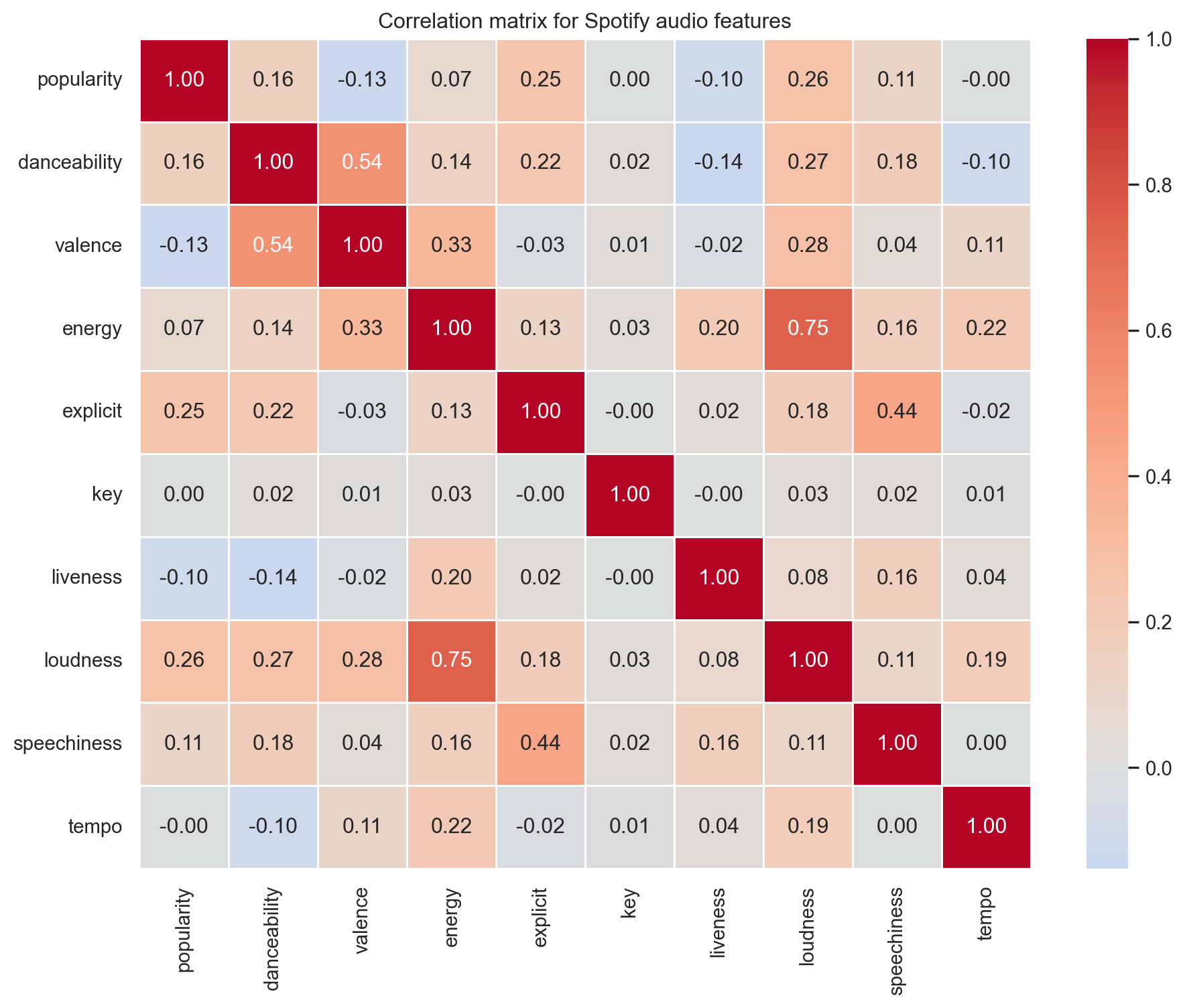
Let’s explore how these features relate to each other. We use a correlation for this, a correlation matrix reveals which dimensions move together and which carry independent information.
A few patterns stand out. energy and loudness are strongly positively correlated i.e., louder tracks tend to feel more intense. Meanwhile, features like danceability and valence are relatively independent, meaning they carry distinct information that K-Means can use to find finer-grained groupings.
Let’s visualise three of the most important audio dimensions in 3D to get a sense of whether natural groupings exist before the algorithm even runs.
Code
fig = px.scatter_3d( spotify, x="danceability", y="energy", z="valence", color="popularity", color_continuous_scale="Viridis", opacity=0.7, title="Songs in 3D audio feature space",)fig
The data does not form obvious, well-separated blobs and that’s normal. Real-world music is a mix of lost of genres, with various songs from different countries etc. When we look at the 3D image and rotate it you can see every song is a bit mixed it’s on this basis that the K-Means algorithm is used to will impose structure by finding regions of higher density and drawing boundaries between them.
The Algorithm
K-Means is an iterative algorithm that partitions n observations into k clusters, where each observation belongs to the cluster with the nearest mean (centroid). It operates in three steps:
Step 1: Initialise
Place k centroids at random positions in the feature space. These are the initial “guesses” for where the cluster centres might be.
Step 2: Assign
Calculate the Euclidean distance from every song to every centroid. Assign each song to the centroid it is closest to. After this step, every song has a cluster label.
Step 3: Update
Recalculate each centroid as the mean position of all songs assigned to it. The centroid physically moves to the centre of its cluster.
Repeat Steps 2 and 3 until the centroids stop moving (convergence). That’s it. Despite its simplicity, K-Means discovers structure that often aligns strikingly well with human intuition, grouping tracks together, separating for example high-energy bangers from moody songs, and isolating niche micro-genres of music.
But there is a catch. K-Means uses Euclidean distance, which means features with larger numerical ranges will dominate the calculation. Let’s demonstrate this by running K-Means on our raw, unscaled data.
The clusters are heavily imbalanced. Tempo (60–200) is drowning out valence (0–1). The algorithm is essentially clustering on tempo alone, which is not what we want. This is why scaling is non-negotiable.
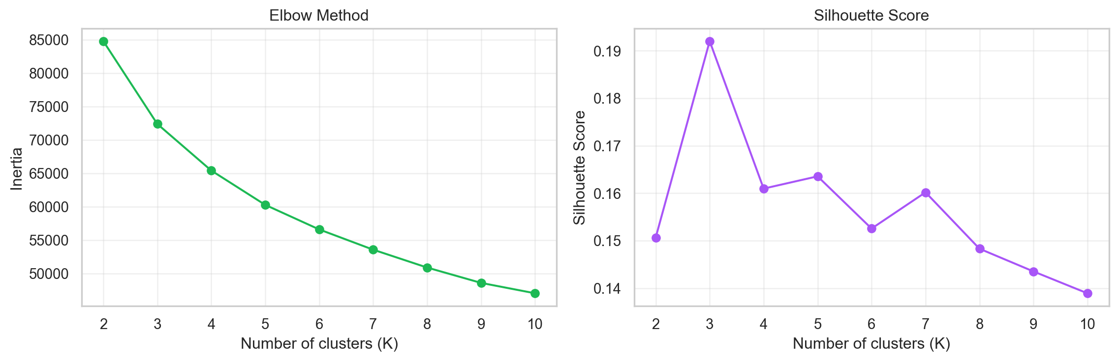
Choosing K
The one hyper-parameter K-Means asks you to set upfront is k, which refers to the number of clusters that you suppose exist in your data. Choose too few and you lump dissimilar songs together. Choose too many and you shatter coherent groups into small fragmented songs. In order to solve for this problem a two standard techniques are normally used to help find the sweet spot.
The Elbow Method
Run K-Means for a range of k values and plot the total within-cluster sum of squares (inertia), a measure of how tightly packed each cluster is. Inertia drops sharply at first, then the curve bends and flattens. The “elbow” which is the point where adding another cluster gives diminishing returns is your target k.
Silhouette Score
The silhouette score measures how similar a song is to its own cluster versus the nearest neighbouring cluster. It ranges from −1 (wrong cluster) to +1 (perfectly placed). In this method we pick the k that maximises the average silhouette score.
Let’s run both diagnostics on the scaled features.
Code
scaler = StandardScaler()spotify_scaled = scaler.fit_transform(spotify_num)inertia = []sil_scores = []K_range =range(2, 11)for k in K_range: km = KMeans(n_clusters=k, random_state=42, n_init=10) km.fit(spotify_scaled) inertia.append(km.inertia_) sil_scores.append(silhouette_score(spotify_scaled, km.labels_))fig, axes = plt.subplots(1, 2, figsize=(12, 4))axes[0].plot(K_range, inertia, marker="o", color="#1DB954")axes[0].set_xticks(range(2, 11))axes[0].set_xlabel("Number of clusters (K)")axes[0].set_ylabel("Inertia")axes[0].set_title("Elbow Method")axes[0].grid(alpha=0.3)axes[1].plot(K_range, sil_scores, marker="o", color="#a855f7")axes[1].set_xticks(range(2, 11))axes[1].set_xlabel("Number of clusters (K)")axes[1].set_ylabel("Silhouette Score")axes[1].set_title("Silhouette Score")axes[1].grid(alpha=0.3)plt.tight_layout()
The elbow suggests that the marginal benefit of adding clusters starts to taper around k = 5 or 6. We choose K = 6, a number that also aligns with Spotify’s own convention of offering six personalised Daily Mixes. This gives us enough granularity to capture distinct groups without fragmenting the data into uninterpretable fragmented groups.
Building the Playlist
Now we assemble the full pipeline: scale, reduce, cluster, and generate playlists.
Scale Features
Standardisation transforms every feature to zero mean and unit variance. After scaling, a one-unit change in danceability carries the same weight as a one-unit change in tempo. We already computed spotify_scaled above now let’s verify the improvement by clustering it.
Compare this to the raw clustering: the inertia is dramatically lower and the cluster sizes are far more balanced. Every feature now contributes proportionally to the distance calculation.
Reduce Dimensions with PCA
We now have 10 numeric features, which means each song lives as a point in a 10-dimensional space. That is difficult to reason about and contains redundant information, energy and loudness, for example, tend to move together, so they are partly telling us the same thing.
Principal Component Analysis (PCA) solves this by finding a smaller set of new axes called principal components that together capture as much of the original variation as possible, but without the redundancy.
Think of it like this. Imagine you have a cloud of points spread out in a room. Instead of describing every point using its original x, y, and z coordinates, PCA asks: what is the single direction in this room along which the points are most spread out? That becomes the first principal component. Then it finds the next most important direction that is perpendicular to the first, and so on. Each new axis is a blend of the original features, chosen to summarise the data as efficiently as possible.
For our songs, the first principal component might capture something like “overall sonic intensity” which is a combination of energy, loudness, and tempo. The second might capture “mood” a blend of valence and danceability. We do not define these manually; PCA discovers them from the data.
The practical benefit here is twofold: fewer, cleaner inputs for K-Means to work with, and the ability to visualise clusters in 2D or 3D rather than across 10 axes simultaneously.
The first three components together account for roughly 53% of the total variance in the dataset. We are compressing 10 dimensions down to 3 while retaining more than half the information, a worthwhile trade-off that will remove majority of the noise and give K-Means a cleaner data to work on.
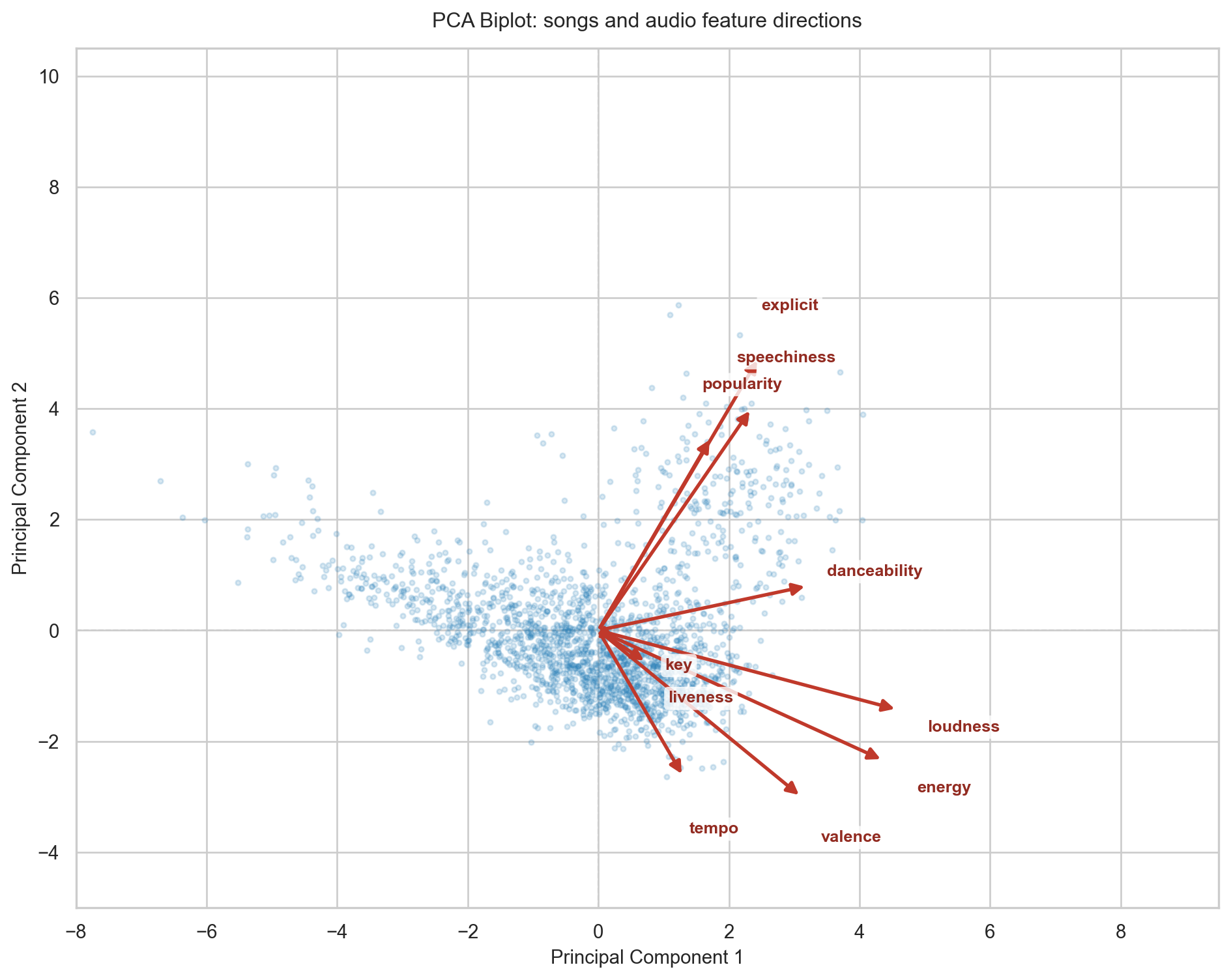
A biplot is the standard way to see what PCA actually did. It overlays two things in a single chart: the songs as points in the new principal component space, and the original audio features as arrows. The direction an arrow points shows which part of the plot that feature pulls songs towards. The length of the arrow reflects how strongly that feature contributed to these two components. Arrows pointing in the same direction indicate features that tend to move together; arrows pointing in opposite directions indicate features that compete.
Code
# Full PCA on all 10 components to extract loadingspca_full = PCA(random_state=42)pca_full.fit(spotify_scaled)# Project songs onto the first two componentsscores = pca_full.transform(spotify_scaled)[:, :2]# Loadings: how each original feature maps onto PC1 and PC2loadings = pca_full.components_[:2].Tfeature_names = spotify_num.columns.tolist()fig, ax = plt.subplots(figsize=(10, 8))# Random sample of songs as points to avoid overplottingrng = np.random.default_rng(42)sample_idx = rng.choice(len(scores), size=2000, replace=False)ax.scatter( scores[sample_idx, 0], scores[sample_idx, 1], alpha=0.18, s=8, color="#2980b9", zorder=1, rasterized=True,)# Scale arrows so the longest arrow tipmax_loading = np.sqrt((loadings **2).sum(axis=1)).max()arrow_scale =5.5/ max_loadingnudge =1.05# extra push beyond arrowhead so labels never sit on the tipfor i, feature inenumerate(feature_names): dx = loadings[i, 0] * arrow_scale dy = loadings[i, 1] * arrow_scale ax.annotate("", xy=(dx, dy), xytext=(0, 0), arrowprops=dict( arrowstyle="-|>", color="#c0392b", lw=2.0, mutation_scale=14, ), zorder=4, )# Place label just beyond the arrowhead in the same radial direction length = np.sqrt(dx **2+ dy **2) lx = dx + (dx / length) * nudge ly = dy + (dy / length) * nudge ax.text( lx, ly, feature, fontsize=9.5, color="#922b21", ha="center", va="center", fontweight="bold", bbox=dict( facecolor="white", edgecolor="none", alpha=0.8, pad=2, boxstyle="round,pad=0.25", ), zorder=6, )ax.axhline(0, color="#cccccc", lw=0.8, ls="--", zorder=0)ax.axvline(0, color="#cccccc", lw=0.8, ls="--", zorder=0)ax.set_xlim(-8.0, 9.5)ax.set_ylim(-5.0, 10.5)ax.set_xlabel("Principal Component 1", fontsize=11)ax.set_ylabel("Principal Component 2", fontsize=11)ax.set_title("PCA Biplot: songs and audio feature directions", fontsize=12, pad=12)plt.tight_layout()
Reading the biplot confirms the intuition. energy and loudness point in nearly the same direction, which tells us they carry similar information where loud tracks are almost always energetic ones. valence and danceability point in a different direction, capturing a separate dimension of mood and rhythm. speechiness and liveness point roughly opposite to instrumentalness-adjacent features, meaning the algorithm separates vocal-heavy tracks from pure instrumentals along this axis. Each blue dot is a song; each red arrow is an audio feature. The further a song sits along the direction an arrow is pointing, the more of that quality it has , so a dot far to the right along the energy arrow belongs to a high-energy track.
Cluster
With scaled, PCA-transformed features, let’s run the final K-Means model.
The profile tells a story. Look for clusters with high energy and loudness, those are your workout mixes. Clusters with low energy and moderate valence are late-night wind-down playlists. High danceability with high valence? That’s your Friday night pre-game. The algorithm found these groupings purely from the geometry of the data with no help from genre labels, mood tags or any particular human curation.
Visualise the Clusters
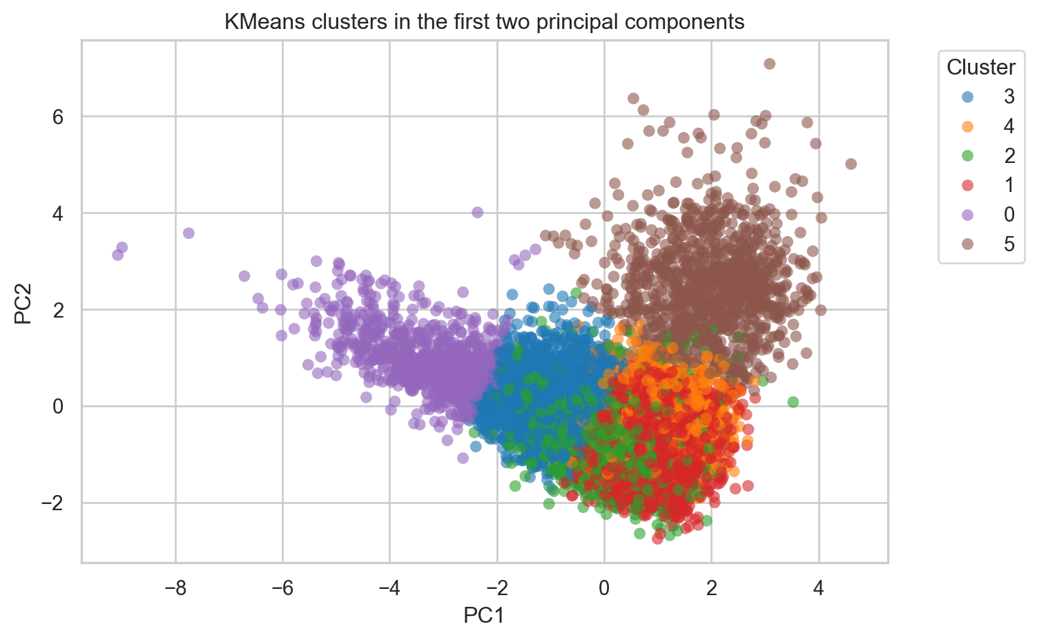
Let’s confirm the clusters form coherent regions. First, a 2D view using the first two principal components.
Code
plot_df = pd.DataFrame(spotify_pca[:, :2], columns=["PC1", "PC2"])plot_df["cluster"] = labels_final.astype(str)fig, ax = plt.subplots(figsize=(8, 5))sns.scatterplot( data=plot_df, x="PC1", y="PC2", hue="cluster", palette="tab10", alpha=0.6, s=40, ax=ax, edgecolor="none",)ax.set_title("KMeans clusters in the first two principal components")ax.legend(title="Cluster", bbox_to_anchor=(1.05, 1), loc="upper left")plt.tight_layout()
The clusters occupy distinct regions of the PCA space, with some overlap at the boundaries, exactly what we’d expect from continuous audio features rather than discrete categories.
Now let’s return to the original 3D audio feature space to confirm the groupings hold up in interpretable dimensions.
The clusters are visibly separable across danceability, energy, and valence, three dimensions that map directly to how listeners experience music.
Generate Playlists
Now we label each cluster based on its audio profile and extract a sample playlist from each. This is the payoff, coherent, themed track lists generated entirely by the algorithm.
Below is a sample of what the output looks like, two contrasting playlists the algorithm discovered from the data. For each, we show the top 5 tracks by popularity: the songs it would surface first for a listener whose taste matches that cluster’s sonic fingerprint. Notice how every track within a group feels cohesive, despite no genre label ever being used.
Late-Night Chill
Cluster 0 · 866 tracks
energy 0.14dance 0.31valence 0.16101 bpm
1Fly Me to the MoonThe Macarons Project
2Sea ChangeStephan Moccio
3NepentheClyde Boudreaux
4We Contain Multitudes (from home)Ólafur Arnalds
5Med slutna ögonNajma Wallin
High-Energy Bangers
Cluster 1 · 2152 tracks
energy 0.79dance 0.54valence 0.63135 bpm
1CarameloOzuna
2Se Me OlvidóChristian Nodal
3Amor TóxicoChristian Nodal
4Mad LoveMabel
5это ли счастье?Rauf & Faik
The beauty of this approach is that genre never enters the equation. The algorithm groups tracks purely by how they sound, which means it can surface unexpected connections for example a folk track next to an ambient electronic song, all brought together based on their shared acousticness and low energy.
We started with a question; how does Spotify know what I want to hear? and arrived at a working answer: represent every song as a point in a multi-dimensional feature space, then let K-Means discover the natural groupings.
The algorithm is elegant in its simplicity and is able to deliver good results.