A practical walkthrough using a loan pre-approval experiment
Business Analytics
Author
Tom Nangosyah
Published
July 5, 2026
A team wants to change something, a form, a price, a feature, because they believe it will improve results. That belief is often reasonable, but it is still a guess. Rolling the change out to everyone and hoping for the best means you never really know whether it helped, made things worse or made no difference at all.
An A/B test helps to give some clarity with some plausible evidence. To carryout this test you show the current version to one group and the new version to another, chosen at random, and let real customers tell you which one performs better. In this example I try to show how it could ideally be done, I will use an example of a bank testing whether an AI-powered pre-approval widget gets more customers through a loan application than a manual form that is mostly used in most local banks.
We have two groups of customers i.e.,
Group A (control): customers who see the standard 5-field manual income form.
Group B (treatment): customers who see an AI widget that reads their existing transaction history and shows them a pre-approved loan amount instantly, no typing required.
Two questions matter here:
Do more people finish the application? This is the main thing we are testing, since a shorter, easier process should reduce drop-off.
Do the loans people ask for change in size? A secondary question, since removing friction could also change who applies and for how much.
We also track where in the process people give up, since that tells us not just whether the change worked but exactly which step it fixed.
In order to run the experiment we need data, and for this example we shall generate some synthetic data for purposes of illustration, ofcourse if this came out at your job or through consultancy with a company this data would come straight from the bank’s event tracking, one row per customer, one column per step they reached. To keep the mechanics visible end to end, we simulate that data here: 8,000 customers per group moving through four steps, clicking into the loan section, starting the form or widget, accepting the terms, and submitting the application.
Show Python code
N_A, N_B =8000, 8000# Stage-by-stage advance probabilities, conditional on reaching the prior stagestage_probs = {# click -> step1 step1 -> terms terms -> submit"A_manual": [1.00, 0.62, 0.70, 0.82],"B_ai": [1.00, 0.74, 0.78, 0.88],}stage_names = ["dashboard_click", "step1_entry", "terms_accepted", "submitted"]def simulate_funnel(n, probs, variant): reached = np.ones(n, dtype=bool) stages = {stage_names[0]: reached.copy()}for i inrange(1, len(stage_names)): advance = (RNG.random(n) < probs[i]) & reached reached = advance stages[stage_names[i]] = reached.copy() submitted = stages["submitted"]# Loan amount is only defined for submitters. AI users skew slightly# higher because pre-approval surfaces their true borrowing capacity. sigma =0.45 target_mean =7800if variant =="B_ai"else7200 mu = np.log(target_mean) - sigma**2/2 amount = np.where( submitted, np.round(RNG.lognormal(mu, sigma, n), -1), np.nan, ) out = pd.DataFrame({"variant": variant, "loan_amount": amount})for s in stage_names: out[s] = stages[s].astype(int)return outdf = pd.concat([ simulate_funnel(N_A, stage_probs["A_manual"], "A_manual"), simulate_funnel(N_B, stage_probs["B_ai"], "B_ai"),], ignore_index=True)df.head()
variant
loan_amount
dashboard_click
step1_entry
terms_accepted
submitted
0
A_manual
NaN
1
0
0
0
1
A_manual
NaN
1
0
0
0
2
A_manual
NaN
1
0
0
0
3
A_manual
NaN
1
1
0
0
4
A_manual
NaN
1
1
1
0
Exploratory Data Analysis
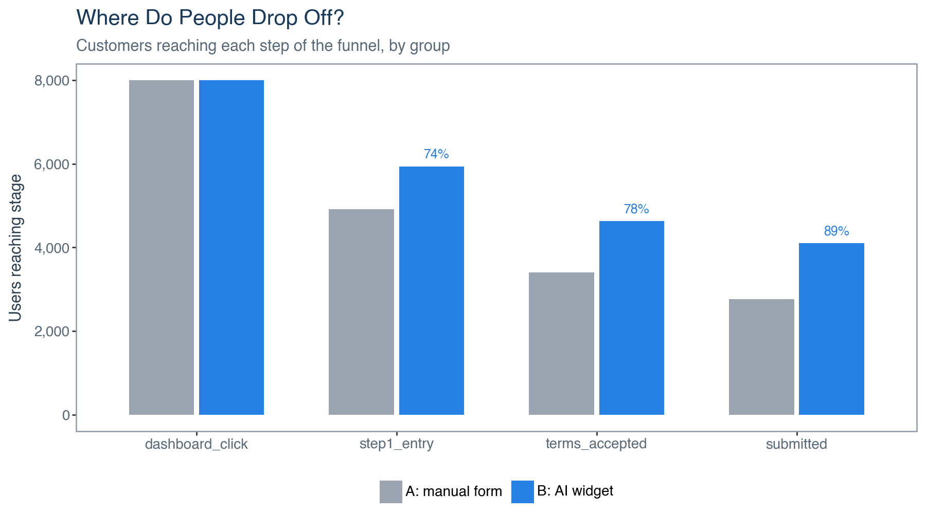
Before running any analysis it’s essentail to do some exploratory data analysis in relation to the research question you’re dealing with, in our case we need to look at the funnel. The table below shows how many customers made it through each step, by group.
funnel_long = ( funnel .reset_index() .melt(id_vars="variant", var_name="stage", value_name="count"))funnel_long["stage"] = pd.Categorical(funnel_long["stage"], categories=stage_names, ordered=True)funnel_long["variant_label"] = funnel_long["variant"].map( {"A_manual": "A: manual form", "B_ai": "B: AI widget"})retention = ( funnel_long[funnel_long["variant"] =="B_ai"] .sort_values("stage") .reset_index(drop=True))retention["prev"] = retention["count"].shift(1)retention["retention"] = retention["count"] / retention["prev"]retention = retention.dropna(subset=["retention"]).copy()p1 = ( ggplot(funnel_long, aes(x="stage", y="count", fill="variant_label"))+ geom_col(position=position_dodge(width=0.7), width=0.65)+ geom_text( retention, aes(x="stage", y="count", label="retention"), format_string="{:.0%}", position=position_nudge(x=0.2, y=280), size=9, color=PAL["accent"], fontweight="bold", )+ scale_fill_manual(values=[PAL["muted"], PAL["accent"]])+ scale_y_continuous(labels=lambda l: [f"{int(v):,}"for v in l])+ labs( title="Where Do People Drop Off?", subtitle="Customers reaching each step of the funnel, by group", x="", y="Users reaching stage", )+ theme_ab())p1
Figure 1. Customers reaching each step of the funnel, by group. Percentages above the AI widget bars show the share of customers at each step who made it to the next one.
Both groups lose the most people at the same step, moving from the initial click into actually starting the form or widget: Group A drops from 8,000 to 4,916 customers there (61% continue), while Group B keeps 5,941 of its 8,000 (74%). That is exactly where we would expect the AI widget to help most, since it removes the need to type anything in.
We need to find out whether the widget helped more people to finish the application?
Hypothesis: the AI widget increases the share of visitors who submit a completed application.
This is a comparison of two proportions, so a standard proportion test tells us whether the difference we see is real or just noise or happened by chance.
from statsmodels.stats.proportion import proportions_ztest, proportion_confintsuccess = conv["sum"].valuesnobs = conv["size"].values # order: A_manual, B_ai (alphabetical)z_stat, z_p = proportions_ztest(success[::-1], nobs[::-1]) # B vs Ap_a, p_b = conv.loc["A_manual", "rate"], conv.loc["B_ai", "rate"]ci_a = proportion_confint(success[0], nobs[0], method="wilson")ci_b = proportion_confint(success[1], nobs[1], method="wilson")print(f"Conversion A: {p_a:.3f} (95% CI {ci_a[0]:.3f} to {ci_a[1]:.3f})")print(f"Conversion B: {p_b:.3f} (95% CI {ci_b[0]:.3f} to {ci_b[1]:.3f})")print(f"Two-proportion z-test: z={z_stat:.2f}, p={z_p:.3e}")print(f"Absolute lift: {p_b-p_a:+.3f} | Relative: {(p_b-p_a)/p_a:+.1%}")
Conversion A: 0.346  (95% CI 0.335 to 0.356)
Conversion B: 0.513  (95% CI 0.502 to 0.524)
Two-proportion z-test: z=21.32, p=6.926e-101
Absolute lift: +0.167 | Relative: +48.3%
Show Python code
# Chi-square cross-check, equivalent to the z-test for a 2x2 tablect = pd.crosstab(df["variant"], df["submitted"])chi2, p, dof, _ = stats.chi2_contingency(ct)print(f"Chi-square: {chi2:.2f}, dof={dof}, p={p:.3e}")
Chi-square: 454.00, dof=1, p=9.743e-101
The p-value here is far below 0.001 (z = 21.32, p ≈ 6.9e-101), meaning it’s unlikely that this difference happened by luck. The AI widget genuinely increases completion: 34.6% of Group A submitted an application versus 51.3% of Group B, a lift of 16.7%. The 95% confidence interval (33.5% to 35.6% for A, 50.2% to 52.4% for B) gives a realistic range for how large that improvement really is, which matters more for planning than the point estimate alone.
We need to find out for those who submitted if the loan size asked for changed ?
Hypothesis: among people who submitted, AI widget users asked for larger loans on average than manual form users.
Loan amounts can be skewed, because a handful of large loans can pull the average up, so here we use two different tests to make sure the finding holds either way.
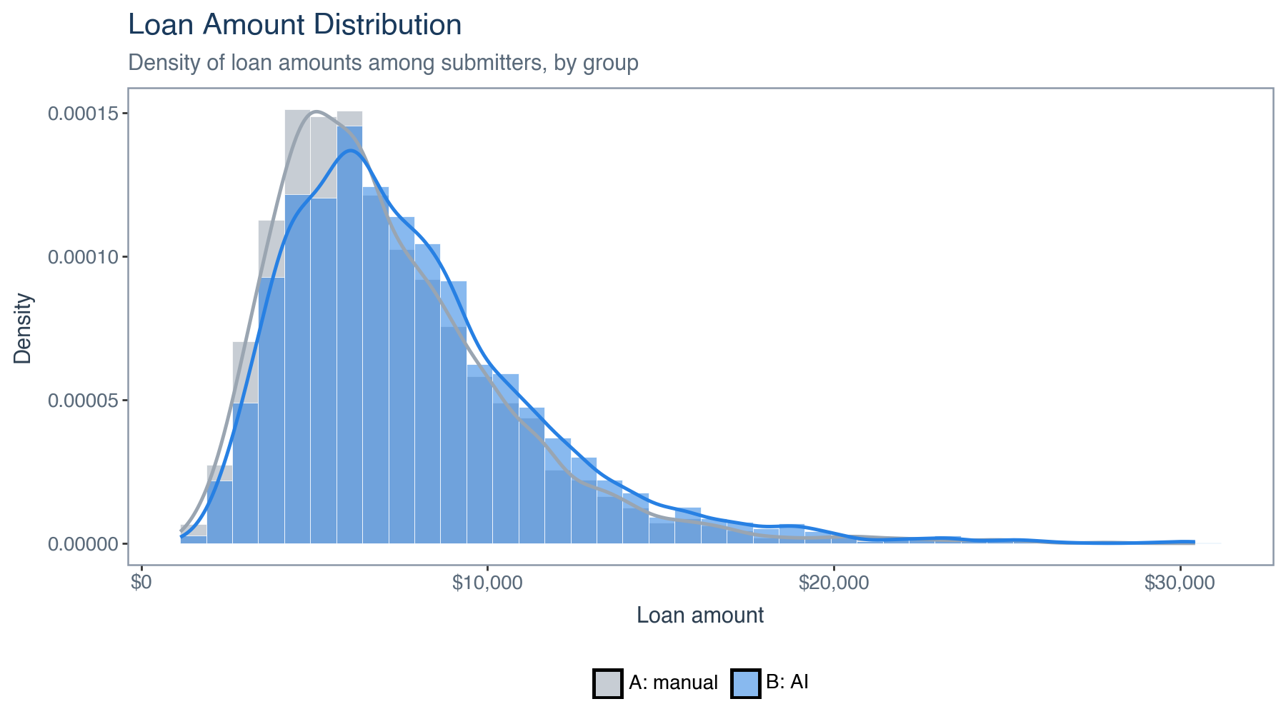
Mean loan A: $7,142 | B: $7,782
Welch t-test : t=7.33, p=2.541e-13
Mann-Whitney : U=6286620, p=1.156e-14
Cohen's d    : 0.179
Show Python code
loan_df = pd.concat([ amt_a.to_frame("loan_amount").assign(variant_label="A: manual"), amt_b.to_frame("loan_amount").assign(variant_label="B: AI"),])p2 = ( ggplot(loan_df, aes(x="loan_amount", fill="variant_label"))+ geom_histogram(aes(y=after_stat("density")), bins=40, alpha=0.55, position="identity", color="white", size=0.15)+ geom_density(aes(color="variant_label"), alpha=0, size=1)+ scale_fill_manual(values=[PAL["muted"], PAL["accent"]])+ scale_color_manual(values=[PAL["muted"], PAL["accent"]])+ scale_x_continuous(labels=lambda l: [f"${int(v):,}"for v in l])+ labs( title="Loan Amount Distribution", subtitle="Density of loan amounts among submitters, by group", x="Loan amount", y="Density", )+ guides(color=False)+ theme_ab())p2
Figure 2. Loan amount distribution among submitters, by group.
Both tests agree that AI widget applicants ask for slightly larger loans, averaging $7,782 versus $7,142 for the manual form (Welch t = 7.33, p < 0.001; Mann-Whitney p < 0.001). Cohen’s d, which measures the size of that gap rather than just whether it exists, is small here at 0.18. That tells us the loan size effect might be real but is modest, and the bigger driver of the business case is likely the completion rate improvement.
Interpreting this result in terms of business cost/revenue to the company
When carrying out these statistical tests we can only come to conclusion on the difference and whether it exists or not, however this doesn’t tell us whether that difference is worth acting on. To answer that question, we need to translate both results into an estimate of loan volume the bank could expect per 10,000 visitors if it rolled the widget feature out to everyone.
Originated volume per visitor  A: $2,469 | B: $3,989
Uplift per 10k visitors: $15,199,137
For every 10,000 visitors routed to the AI widget instead of the manual form, that works out to roughly $15.2 million more in originated loan volume, $3,989 per visitor for the AI widget against $2,469 for the manual form.
In some cases such tests can be misleading and its advised to check before you trust the test results like this, in order to do this we can think of a few things:
Sample size and duration: A test needs enough customers, and enough time, to cover normal variation, weekday versus weekend traffic, paydays, marketing pushes. A result from three days of data will be far less trustworthy than one from a full business month or cycle.
Check metrics: A test can win on the metric you are watching and quietly damage something else. Here, that could mean checking default rates or complaint volume on AI-approved loans, not just how many people applied.
Effects born out of a feature being new: A shiny new widget can convert well simply because it is new. Effects that fade after a few weeks are a different thing from a genuine, lasting improvement, therefore it would be worth to also check for week on week differences if necessary.
Practical significance, not just statistical significance: With enough customers, even a tiny, meaningless difference can become statistically significant. Always ask whether the size of the effect, not just its existence, is large enough to matter, here subject matter knowledge might save you from wrong results.
Therefore from out test results we can make some conclusions and recommendations as follows:
It’s clear that more people complete the application and the AI widget meaningfully increases the end-to-end completion rate, from 34.6% to 51.3% (a 16.7%, approx. 48% relative lift, p < 0.001), with the biggest gain right at the form step, exactly where removing manual data entry should help most.
Loan amounts requested for by customers are modestly higher among AI widget applicants, $7,782 versus $7,142 on average (Cohen’s d = 0.18), though this is a secondary effect next to the completion rate gain.
Together, these push originated loan volume up meaningfully per visitor, an estimated $15.2 million uplift per 10,000 visitors, with the estimated uplift per 10,000 visitors is shown above.
We can recommendation a roll out the AI pre-approval widget to all users. Every metric in this test, completion rate, average loan size and total originated volume, moves in the same direction, and the evidence behind the main result is statistically sound.